Firefox add-ons store has a new layout
Mozilla has updated the layout of extension listings on its add-ons repository. It's a redesign, alright.
For those new to Firefox, I'm talking about addons.mozilla.org, also known as AMO.
Regular readers maybe aware that I used to review Firefox add-ons regularly until a few years ago. Though I don't do that anymore, I still visit the AMO to discover new extensions, and keep myself up-to-date. I was doing the same thing today, but something didn't look quite right. For a second, I actually wondered if I was on the correct website. Whenever I visit the AMO, I immediately look to the left, to check when the add-on was updated, developer's page, support link, etc. It's sort of like muscle memory.
The sidebar wasn't there anymore. I was fairly certain that I didn't see this design a few days ago, when I installed the Tab Stash add-on. Silly me, why not just look at the Internet Archive?

I was right. Here is an archived version of the uBlock Origin listing on the AMO from July 25, which was three days ago. (Live link here)
This is the new layout, it shows all the information the older design used to, there's no problem with that.

But there are some issues. Like I mentioned earlier, you could just glance at the sidebar to learn more about an add-on, now you have to scroll like 4 times to get the same details. The wasted space on the sides could have been put to better use. BTW, this is on default zoom.
Anyway, what's new with the AMO layout?
Mozilla has not changed the way the add-on's icon, name and developer name are displayed. The developer's name is still clickable, to discover other extensions they created. (Refer to the above images)
The Recommended, and the "Available on Firefox for Android" badges have been moved below the add-on's name. You will find 2 new elements in the header, a star rating + number of user reviews, and the total number of users. Clicking on the star/reviews button takes you to the user reviews section of the add-on.
Mozilla displays the screenshots of the add-on directly below the header. The image viewer is newer, and shows the number of screenshots that are available. There is also an X button in the corner to close the gallery, which seems pointless because you can just click anywhere to dismiss the image viewer.
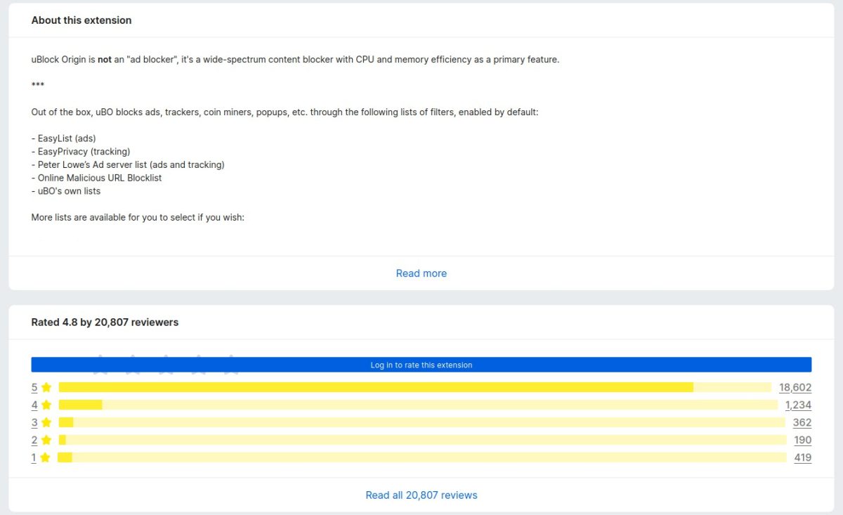
Next comes the description section, "About this extension". Nothing much to say here, this is controlled by the add-on developer. Let's move on. he next section shows the rating/reviews, it's the same 5-star rating system, only it looks a lot longer than before.
Following that, we come to the "Other popular extensions", which promotes other add-ons that you may like.
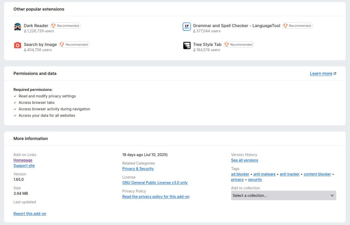
The Permissions and data section lists all permissions that an add-on uses. It is similar to the old design. Next, we have the "More information" panel where you can find the add-on's homepage, support site, version number, size, last updated, related categories, license, privacy policy, version history, and tags. The "Add to collection" menu is available here as well, which seems out of place. Wouldn't it be better if it was in the reviews section?
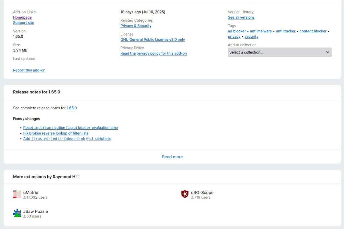
The AMO's last section of the add-on page displays the release notes of the extension. Though the new design is wider, it still has a "Read More" button to view the complete list of changes. And finally, we have the "More extensions by developer section".
Placing the "Other Popular Extensions" section above the permissions and details about the add-on seems like a bad idea. It would have been more appropriate to place the panel at the end of the page, or on the sides which are empty.
The old layout isn't perfect, it has some blank space in the middle, but that could have been used for something else, maybe to even relocate the release notes and "more extensions by the developer" sections.
Take a look at the old vs the new comparison. The blank space at the bottom is because the newer design is longer.
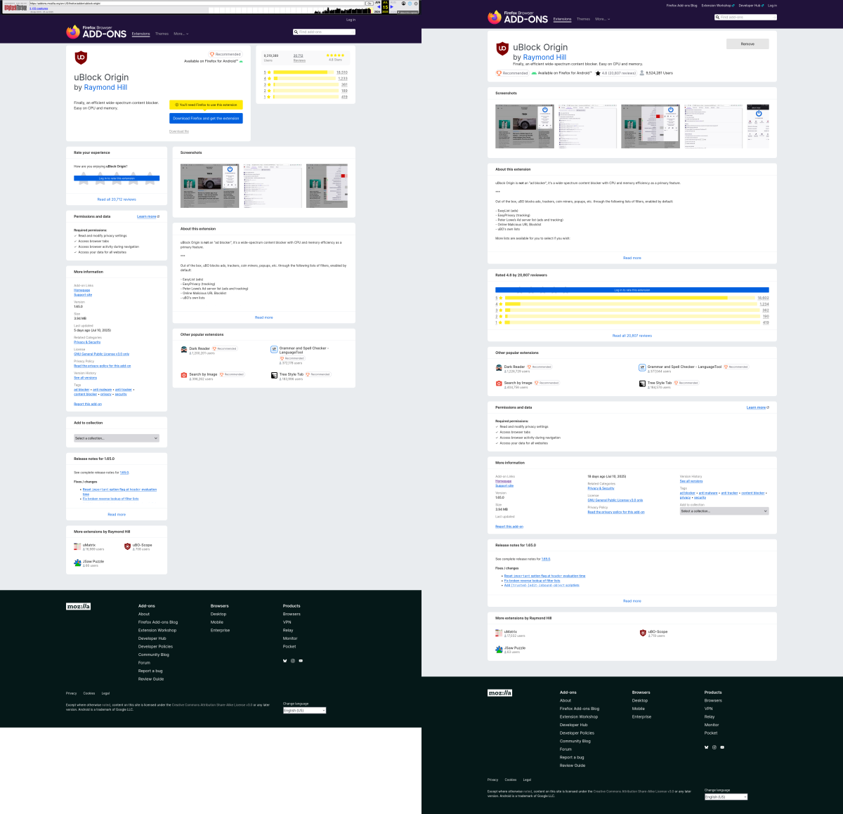
Here is a higher quality version, side-by-side comparison of the old vs new layouts (1.2MB image). I think the redesign looks similar to Chrome's Web Store.
What do you think about the new AMO layout?
Thank you for being a ComTek4u TechTips reader. The post Firefox add-ons store has a new layout appears on ComTek4u TechTips. (via Ghacks)